Latest Comments

Miriam Griffiths A Little Help...
27 November 2024
Perhaps more "was once kinda good and then someone added AI"? I'm getting very fed up of the amount ...
Natalie A Mysterious Hole...
26 November 2024
Oh my! I cannot tell what the hole's size is, but I expect someone is hungry and may be going for ea...
Katrin Very Old Spindle Whorls?
25 November 2024
Yes, the weight is another thing - though there are some very, very lightweight spindles that were a...
Katrin A Little Help...
25 November 2024
Ah well. I guess that is another case of "sounds too good to be true" then...
Miriam Griffiths Very Old Spindle Whorls?
22 November 2024
Agree with you that it comes under the category of "quite hypothetical". If the finds were from a cu...
JUN
14
0

The Madder-Ness.

One of the main things on my desk at the moment is work on the Madder Baselines experiment - at least a bit of a preliminary write-up has to be done, and, well, I am more and more convinced the stuff is called madder because it makes me... the same.

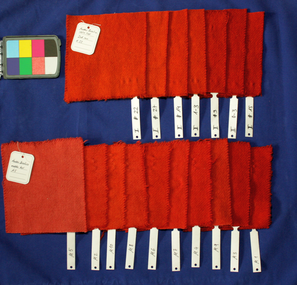
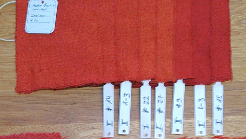
Also, there's such a huge difference between looking at colours on the fabrics in real life and in daylight, and in looking at them on a photograph on the screen. Print will probably be different again, too, but for now, I'm frustrated enough by not getting nearly as much of a difference on the pictures than they show when yo look at the objects.

On that image, four should be very similar to each other, and the other two quite different from the group, with some difference between them as well. That's one of the better images actually, where it's relatively easy to distinguish at least on my screen. The others... ah well.

There's also quite a stack of results (dye-wise) that I'm not sure how to make sense of. Samples that should be exactly the same colour are sometimes (almost) the same, sometimes not. The samples from the pots running in parallel are quite well-matched to each other, the samples from a second run with the same ingredients don't match those of the first run.

As I said - quite surely, madder comes from crazy!

At least it's a pretty red. Or some of them. Mostly.

0
JUN
06
0

Colour Measurements...

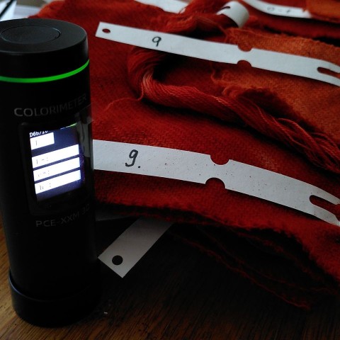
So after finding out about how difficult it is to judge, compare, and describe (or colour-list-match) colours by eye, I'm now trying to see if a colour checking tool is helpful in this regard. Which means... hearing a lot of beeps.

Because every time this thing here takes a measurement: 

...there's a little beep.

I'm going for averages, since the samples are not all completely evenly dyed, some more than others. So I've been taking 20+ measurements of each sample so far, and now I have enough to go and see if the data looks useful, or not.

For today I've definitely heard enough beeps!  

0
DEC
07
0

Winding Down.

It feels like we're nearing the end of the year alright - days are getting ever shorter, the cat sleeps more and more (though that is due to age, I think, and not just due to the time of year and weather), and I'm trying to get things sorted for the end of the year, and winding down a little. 

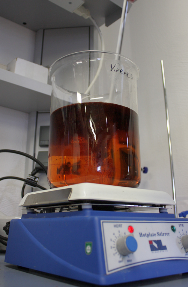
Getting things sorted includes sorting and labeling pictures, and here's one for you: 

That is a good amount of quite expensive ground-up lice about to be stirred into a beaker of hot water. It was really, really exciting to dye with kermes, and I'm feeling very privileged!

That said... the colour turned out very nice indeed, but it's not that you couldn't come close or imitate it with a good knowledge on how to handle your madder and cochineal. Though it may be possible that with some post-processing, it can go more into the purple-y shade, and that might be harder to get with madder and cochineal. But, well, who knows?

It would be really, really interesting though how many people in the Middle Ages and Early Modern Age would have been able to actually tell if something was really done with kermes, or if it was just well-faked. My guess would be that a good fake is indistinguishable from the real thing today, and would have been back then. Similar, probably, with shellfish purple. But, hey, expensive! Prestigious! So definitely a must-have!  

1
NOV
28
0

Red Success.

The dyeing instructions and experiment protocol have been successfully tested:

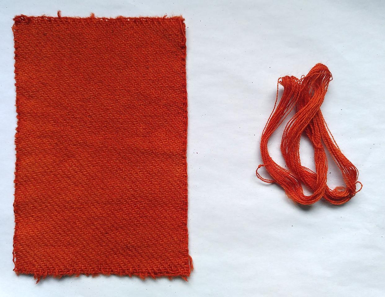
The results? Two beautifully dyed objects, one set of instructions with notes and corrections, and I've already managed to do the fixing-up and the instructions are sent out. 

(The result this time turned out to be a rather orangey colour, by the way. That might be due to the pre-treatment, or a different batch of madder, or the different alum, or the water, or whatever. Madder. Might drive one madder and madder...)

Now it's time for me to wait and see what will happen. I'm already looking forward to getting the first of the samples and be able to compare them to the original reference. And, well, I guess I could also think about when to start my own homework...

1
NOV
27
0

Madder Test... Test Run.

To make sure that all the instructions for the madder dyers influence test are as accurate as possible, and easy to understand, there's a little test run taking place. Thankfully, the Most Patient of All Husbands has taken on the task, so I have the benefit of getting the stuff tested by a non-dyer.

The instruction test is simulating the real thing - so there's Erlangen tap water being used instead of de-ionised water (but at least I filled it into a bottle that once held de-ionised...) and the madder is some that I harvested (and then steamed, and then cut it up and dried some, and then ground it and dried it some more) and the alum is ammonia alum and not potassium alum... but for testing the how-to, it will all do.

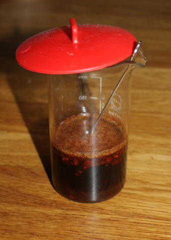
The madder has been soaking, and it looks a promising deep red:

Next will come the mordanting, and then the dyeing, and then I'll fix up the experiment protocol with the missing info and necessary corrections, and then... off it will go to the volunteers. Hooray!

1
NOV
24
1

More Red.

Here's a better picture of the outcome of our dyeing tests for the variations between different madders and different waters: 

So. Can you see differences? What do you think? 

1
NOV
23
2

Colours, colours.

When you're working with colours, definitions or descriptions of them are always an issue. Green as grass, blue as the sky, dark as the night - even these descriptions, time-honoured and always nice, include a large variety of shades.

It would be nice to have a good, solid way of describing colours, wouldn't it? Well. There's electronic colour checkers, there's colour space charts, and then... there's human beings.

One of the little side shenanigans we did at the Forum was test how well a colour checker fan works. These are printed colours with a defined number according to a system - you might be familiar with the RGB system, or have heard of CMYK. There's a number of other systems as well, but in this case, that's only relevant insofar as the number you'll write down as your colour name will change.

We asked people to sit down and try to describe the colours of some of our madder sample dyeings with help of the fan. (Thank you to everyone who did!) Everyone who I asked about how it went agreed on it being difficult, as the printed colour patches were not really matching the actual textile colours.

Well. Having had quite the experience with how dissimilar measurements done on the spinning angle were if taken by different persons, I was a bit suspicious from the start on how well the colour fan might work (or not). It would be really, really nice if it did, making the description of colours easier, and more reliable, and hope springs eternal. 

This is what we had as one set of samples:

It's a rather bad picture, but hopefully you can see that there's a little difference between some of the samples. Make up your own mind on how many groups you'd see regarding darkness/colour depth - myself, I see three in the originals and four in this (bad) picture, with the one to four pieces in the group having no discernable difference.

Here's the clincher: The cloth patches were not sorted by darkness when participants were doing the colour checking and matching. And... as a result, we had the same colour number assigned to the darkest shade and the lightest shade by different people.

Which, to me, means that this simple method is, unfortunately, out - and that you should not trust the colour numbers given by "comparison-by-eye" using a colour fan tool. 

Sigh. It would have been so nice, wouldn't it?

0

Contact